A Brand That’s Strong From A to Zee
Strong brand identity is important for a slew of reasons. When done well, it increases recognition by giving a company an identifying “flag” that’s unique, ownable, and relevant. But a hardy brand identity isn’t something that just happens, no. It must be painstakingly cultivated. Developed with intention. It must stem from fundamental truths about your business or brand and artfully tout who you are through visual elements. Talk about a tall order.
A New ID for Zee
When sanitation experts at Vincit Group approached Maycreate in need of a visual identity for the newest addition under their umbrella– Zee Dairy, we first had to dig into who they are and what defines and differentiates them as a business. We wholeheartedly believe all visual representations of any brand should begin here.
Once our team gained the necessary insight about who Zee Dairy really is and what core values drive the brand, our design team was able to get to work on creating the visual ID and logo system they needed. Maycreate designer, Daniel Jackson, said the team wanted to lean into Zee Dairy’s position in the market “against an ever-looming fear their clients face daily– operation shut down.” Since they exist to improve and protect the dairy brands they work with while preserving their reputations in the industry, it was only fitting to draw on that idea when concepting visuals.

Although Zee Dairy was an emerging venture, the Vincit Group’s portfolio of brands include both protein sanitation and chemical production companies. In this sense, the Zee Dairy team were effectively industry veterans despite the business being brand new. “In this context, the mark needed to assert authority and expertise while also reading as a fresh entry in the hyper-niche dairy sanitation industry– with only 33 competitor brands nationally,” Ian Lewis, Maycreate Designer, said.

From Brand Platform to Visual Identity
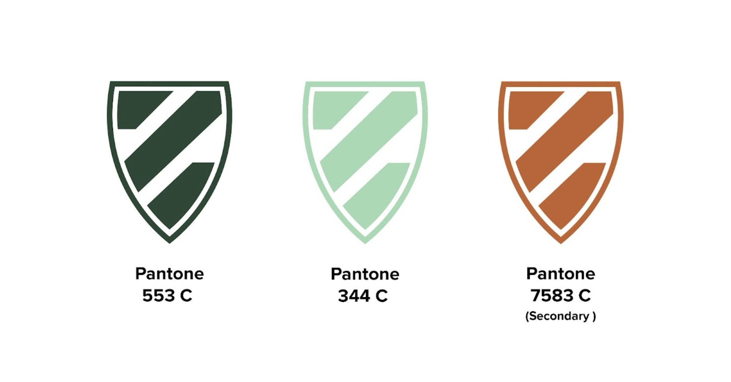
Kicking off this visual identity involved leaning on the brand platform developed by our Senior Brand Strategist and Account Manager, John Wagoner, and Senior Creative Director, Anthony Sims. The basic design process involved a concepting stage in which our designers worked independently to build preliminary digital or physical sketches based on their preferred mediums. From there, the design team worked collaboratively to narrow down and refine concepts, whittling the contenders down to the three strongest options. The winning design featured a shield shape and slightly abstracted “Z.”
“Due to the intensity of the industry and need to execute without error, a feeling of protection was the impetus for the shield as a symbol,” Ian Lewis said. “My design rationale for incorporating the Z shape was that, if done correctly, a stylized Z could be used as a visual element in a systematic application. This manifested as three bars inside the shield shape that imply a Z without being too on-the-nose.”
These visual elements, when paired with a custom-built slab serif wordmark, create a confident and authoritative visual identity that works in both black and white and color. “The ancient symbol of the shield coupled with throwback custom typography grounds the mark in a timeless feel,” Ian Lewis said. “Combining this with a modern, expanded sans serif typeface for the subordinate text brings the design into the present and alludes to a feeling of cutting edge competence in the industry Zee Dairy serves.”

Ready to spruce up your branding?
If you’re looking for a little help in bringing your brand identity to life, our team at Maycreate would love to work alongside you. Contact one of our Brand Strategists, John Wagoner or Aaron Petticord, or give us a call at 423.634.0123 to kick things off today!