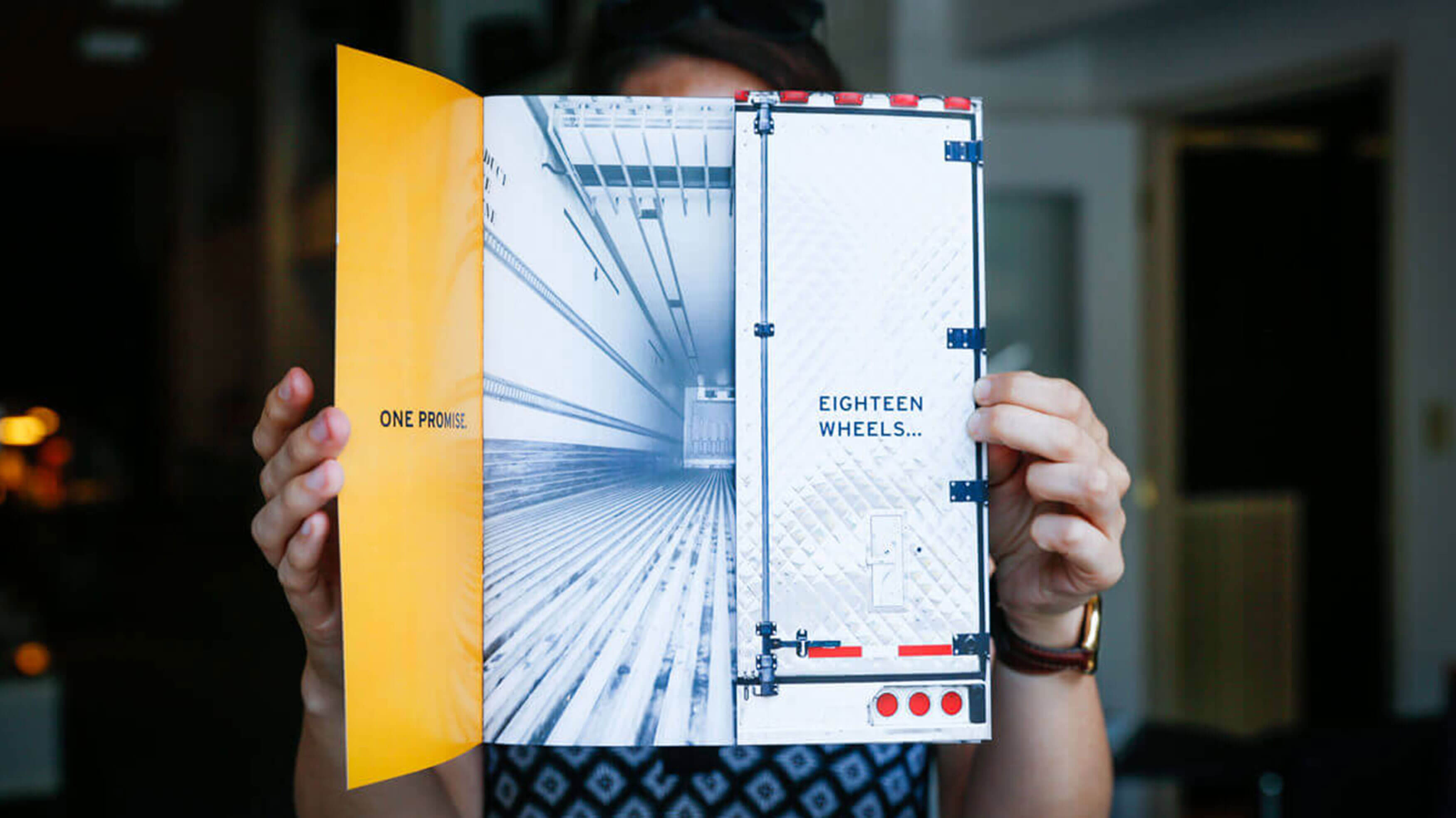
We were launching a startup in one of the most competitive businesses on the road—trucking. There are over 500,000 trucking companies in the U.S. and we knew from the get-go we had to find a memorable and believable way to differentiate AmTrans USA from their competitors.
Because the company was a startup, it had no real history. So, the first thing we did was set up an interview with the CEO. We wanted his vision. Why would he leave one of the largest, most successful trucking companies in the U.S. to start his own trucking firm? For one thing, he wanted to have a global impact on the industry. And secondly, big didn’t mean you’d forget your hometown roots. With these and other insights, we began to build a brand voice and from there we built a brand.
We began with a tagline that made a strong commitment—“Eighteen Wheels. One Promise.” We followed that with a logo that consisted of bold, striking colors and the horizontal stroke in the A symbolized a road to the future.
The signature’s chosen typeface, Idlewild, captured the new brand image with a distinctive look that contained a sense of confidence and determination. It was a font you couldn’t miss. And the brand voice we established for Am Trans had a “take-charge” attitude and assumed a leadership role. The takeaway? Here’s a company that’s headed down the road to success.


